By Jos versteeg

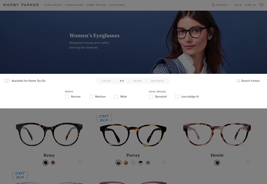
Online shopping with user-friendly filters

Although you can't touch, smell or try on clothes online, the merchandise is clearly presented. A shop's entire product offer is displayed on one page, with everything in sight simply by scrolling down. There's no way physical shopping can compete; the clothes are strewn all over the shop and you first have to unfold or take them from the rack to see what they look like. What's more, you may not be able to find your size or you might want to check out that other shop a few doors down in the shopping centre. In an online environment, all the shops, prices, sizes, shapes and colours are within reach no matter where you are. To keep it all neat and tidy, web shops offer filters that help you narrow down your search, for instance by colour or size. The proper set-up of these functionalities is key in simplifying the web shop user experience.

Current situation
By far the most common filtering layout in web shops is vertical filtering, which sets aside space on the left of the screen for the filter options. This space is based on the so-called F-pattern whereby users scan web pages from left to right and from top to bottom. As such, the assumption is that users will notice the filters first and most web shops copy this pattern without much thought. After carrying out usability tests, however, it appears that users often look straight past the filters. Moreover, displaying the filter and product beside one another causes the viewer's attention to be divided. Ideally, you want to be able to channel the user's attention.

New situation
By placing the filters horizontally above the products, users no longer look past them. This encourages online shoppers to filter the products before plunging into the whole collection. The result is a more targeted shopping experience, which can lead to increased conversion. What's more, filtering beforehand avoids disappointment with users who find out at a later stage that their size is out of stock.

Horizontal filters also save space. Vertical filters don't go as far down the page as the products themselves. This means you are left with a white space once the list of filters ends. Having horizontal filters allows you to fill this otherwise void space with products. Using the whole page width gives designers endless options to create an attractive page layout.

Finally, horizontal filters can be made ‘sticky’. In other words, the filters stay at the top when you scroll down. Therefore, users always have the option to change their preferences, even when they are all the way down the page. This application is already popular on many mobile web shops.

To sum up
The most common product filtering is by no means the most practical and user-friendly. It is important to always be critical. Vertical filters are widely used and, in theory, are consistent with the F-pattern.  However, this does not mean that vertical filters are the best option for filtering. Horizontal filtering ensures users notice the filters earlier, while also providing designers with more space to present products attractively and make optimal use of the available page space. Furthermore, a horizontal filter can be set up to be ‘sticky', meaning the user always has the filters within clicking distance, saving unnecessary scrolling up and down. By looking at the widely accepted elements with a critical eye, life for the online shopper gets a little bit easier with every new development.

Do you need help redesigning your web shop so it is geared to your customers? Then contact Jos Versteeg, jos.versteeg@kega.nl or call +31 (0)252-750275.


Peak Performance · Kega
11 July, 2016

pEaK pERFORMANCE vIRTUAL SHOPS The virtual shops of Peak Performance Outdoor clothing brand Peak Performance pushed the ...

Petersham Nurseries · Kega
2 April, 2018

PETERSHAM NURSERIES One retail trend in recent years has been lifestyle shops. These are shops that focus on a particula...